Kitchen, Dining and Bathroom Update: A Modern Take on Classic Styles
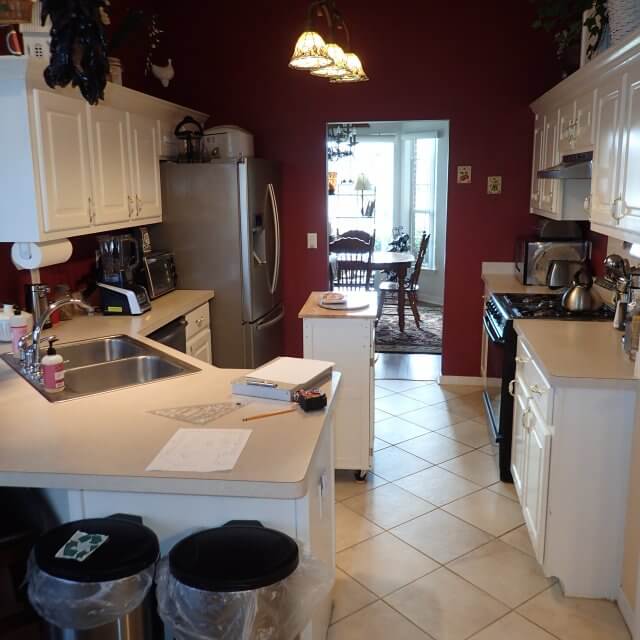
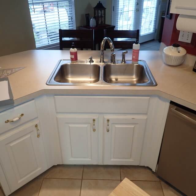
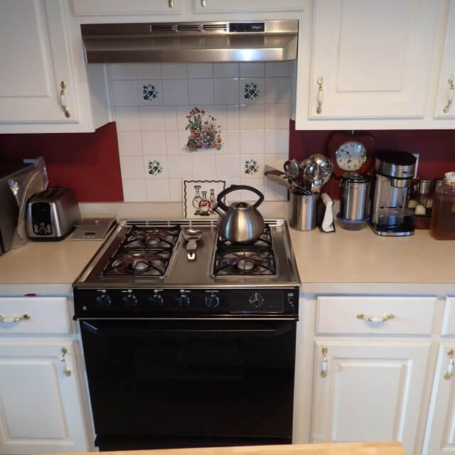
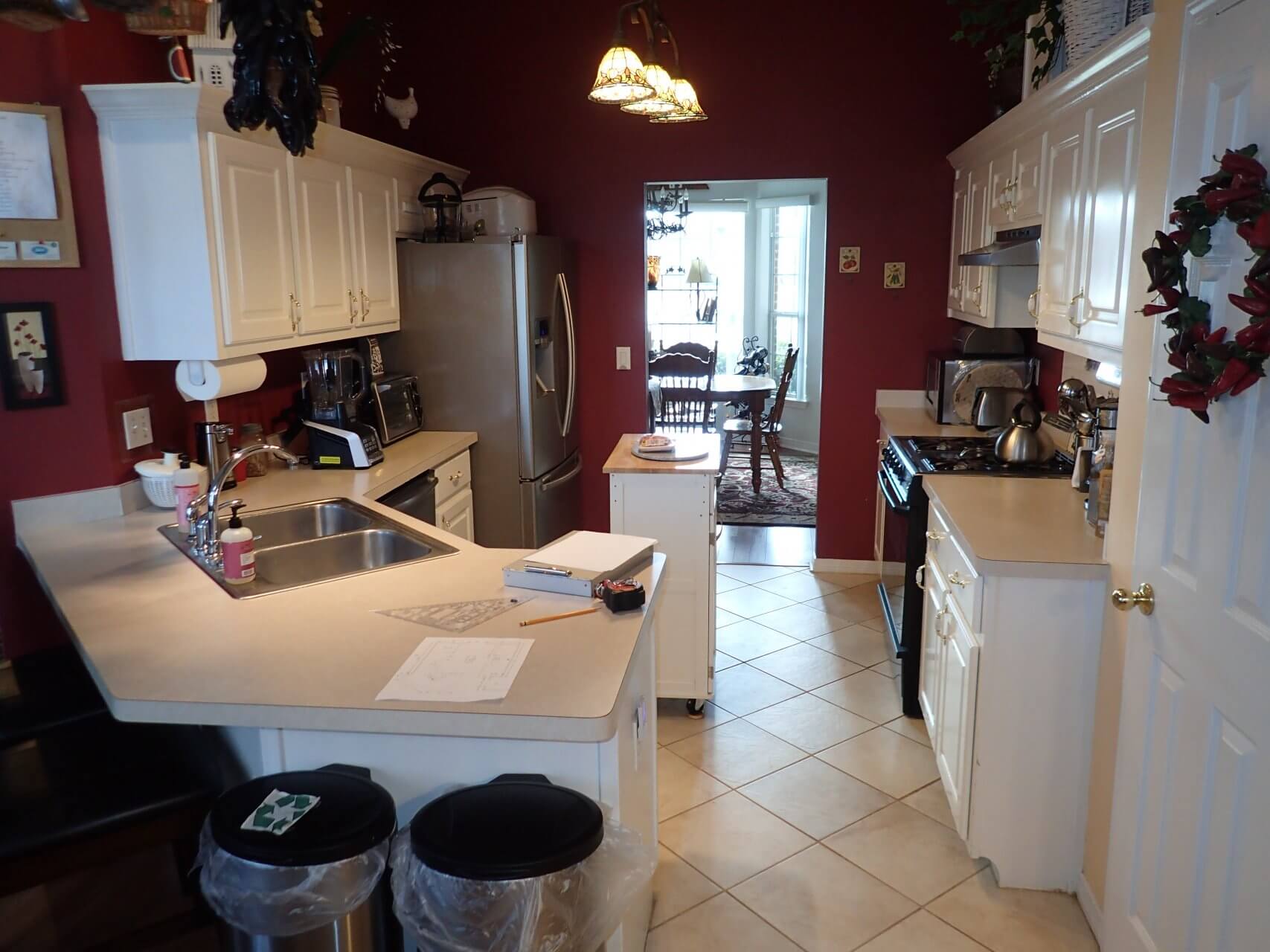
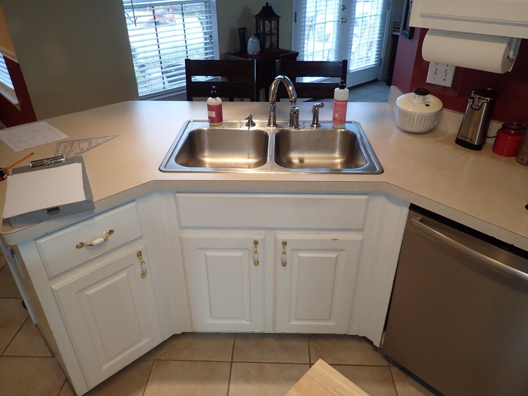
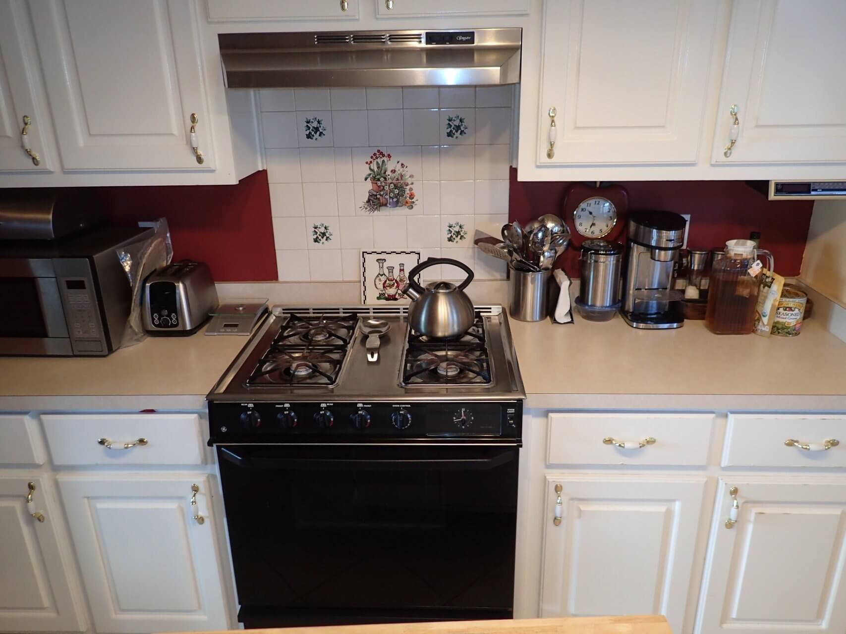
Victoria and Audie approached Cabinet Depot wanting to update their Cantonment home’s tired looking kitchen, dining room and bathroom. While they knew they loved classic design, they needed help creating a fresh take on traditional design elements.
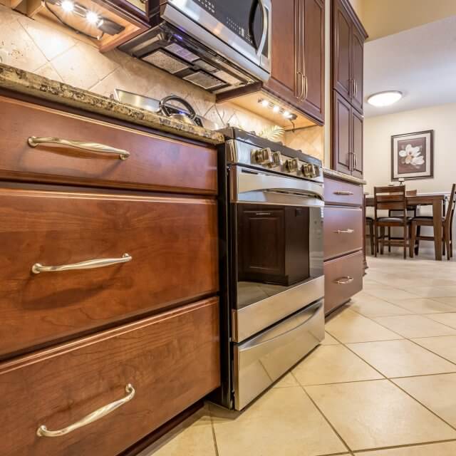
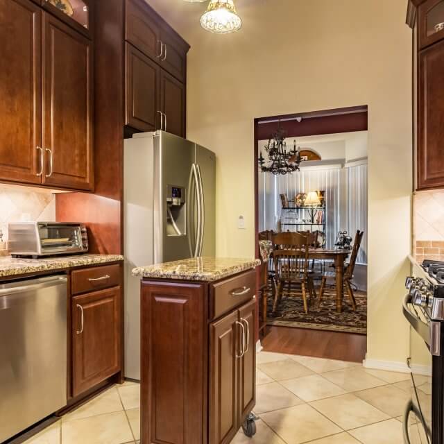
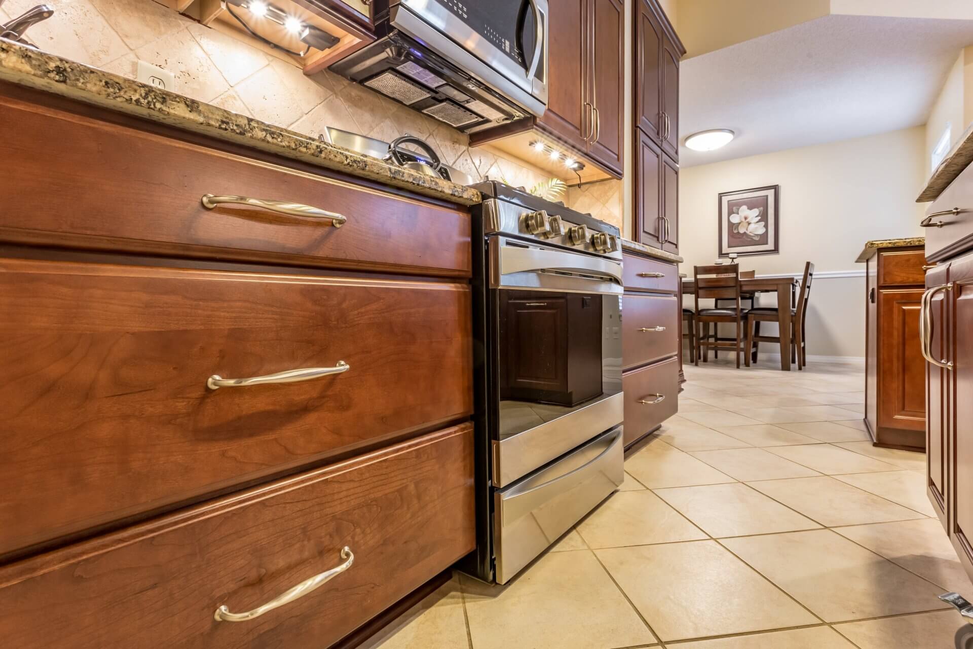
Cabinet Depot helped them achieve just that with a style called Classic Traditional. We added new cabinetry with elegant lines and incorporated architectural elements to the space for a completely new, more modern look.
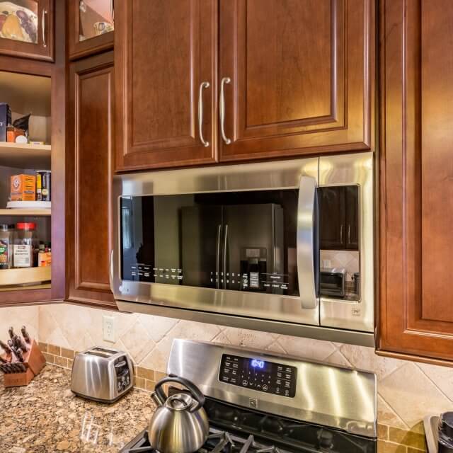
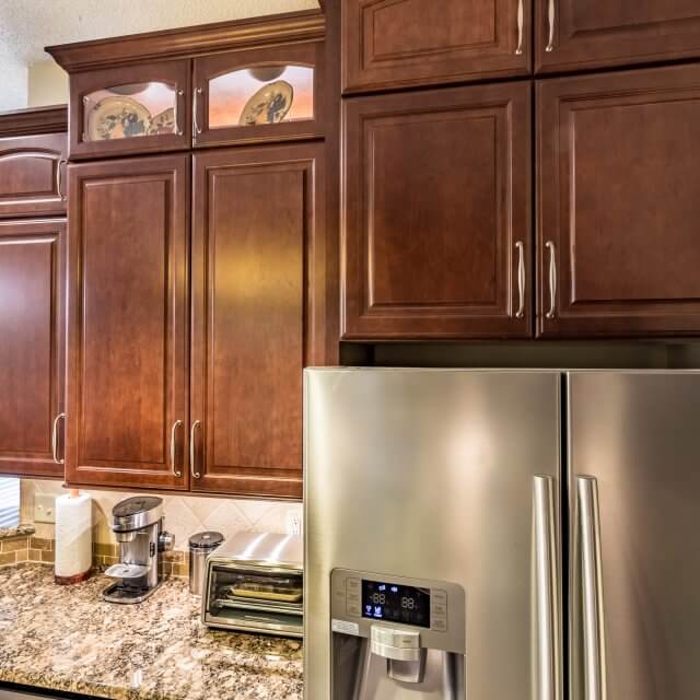
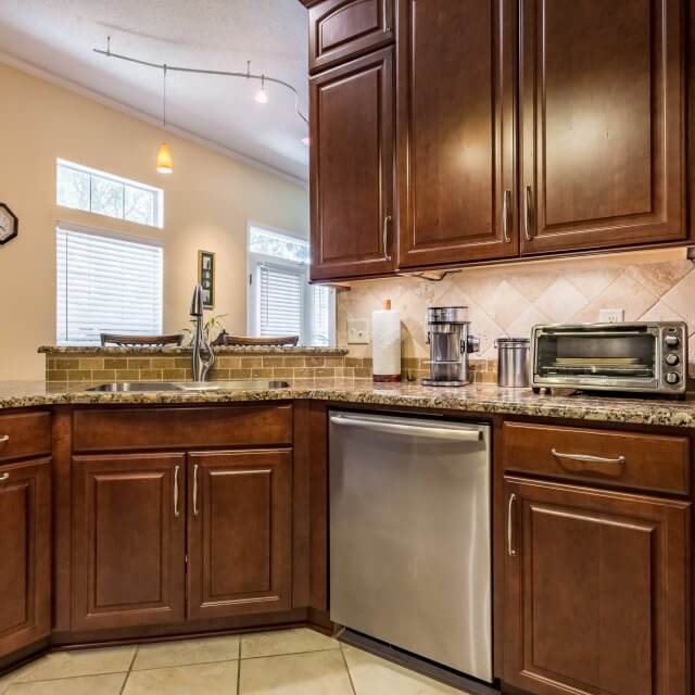
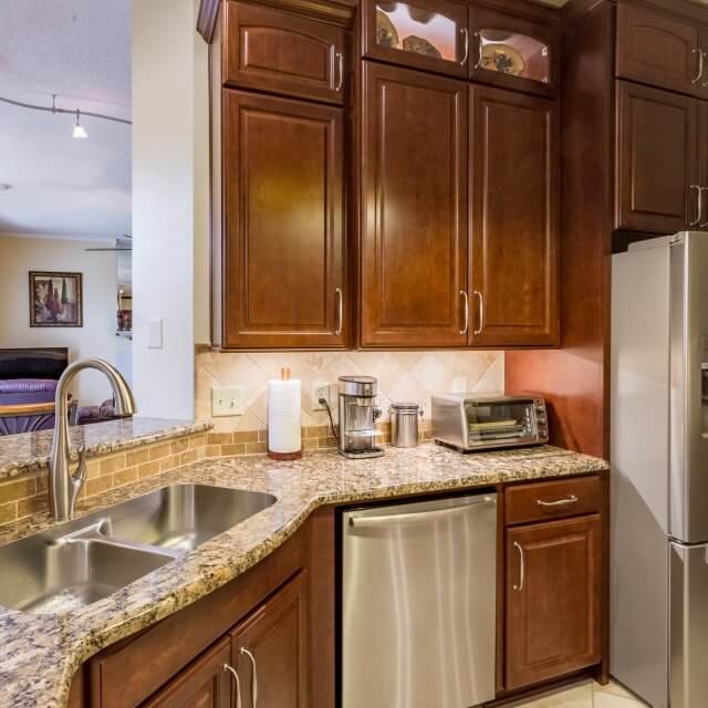
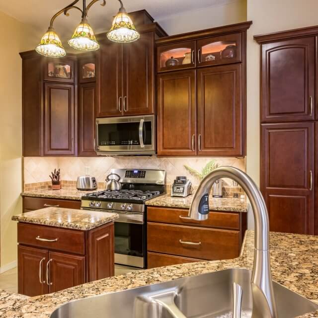
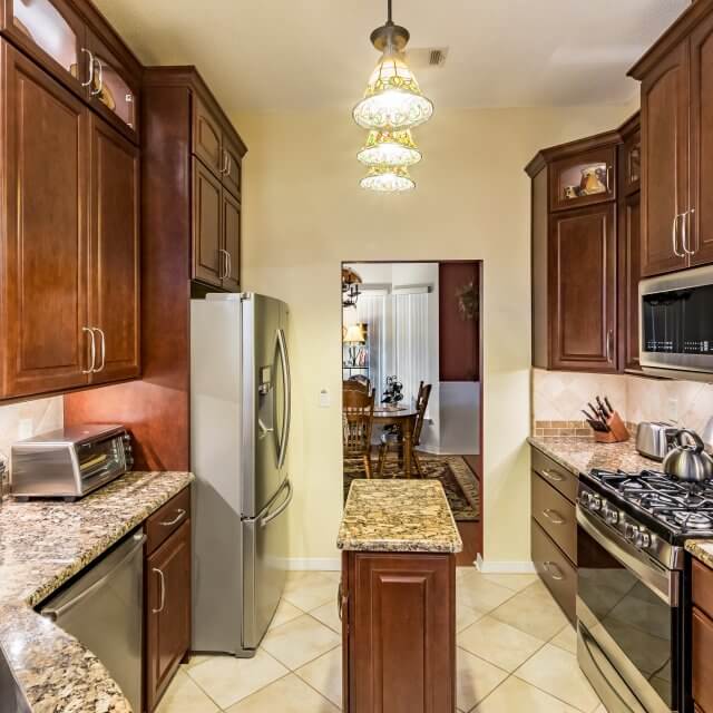
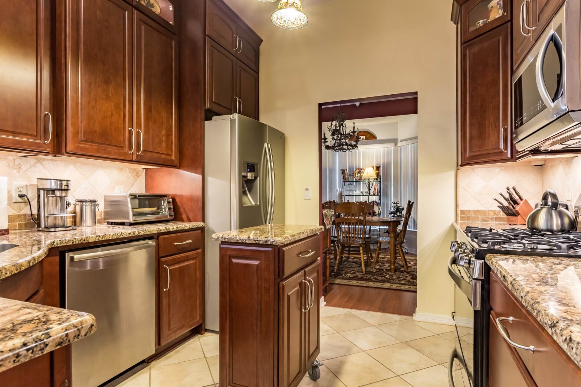
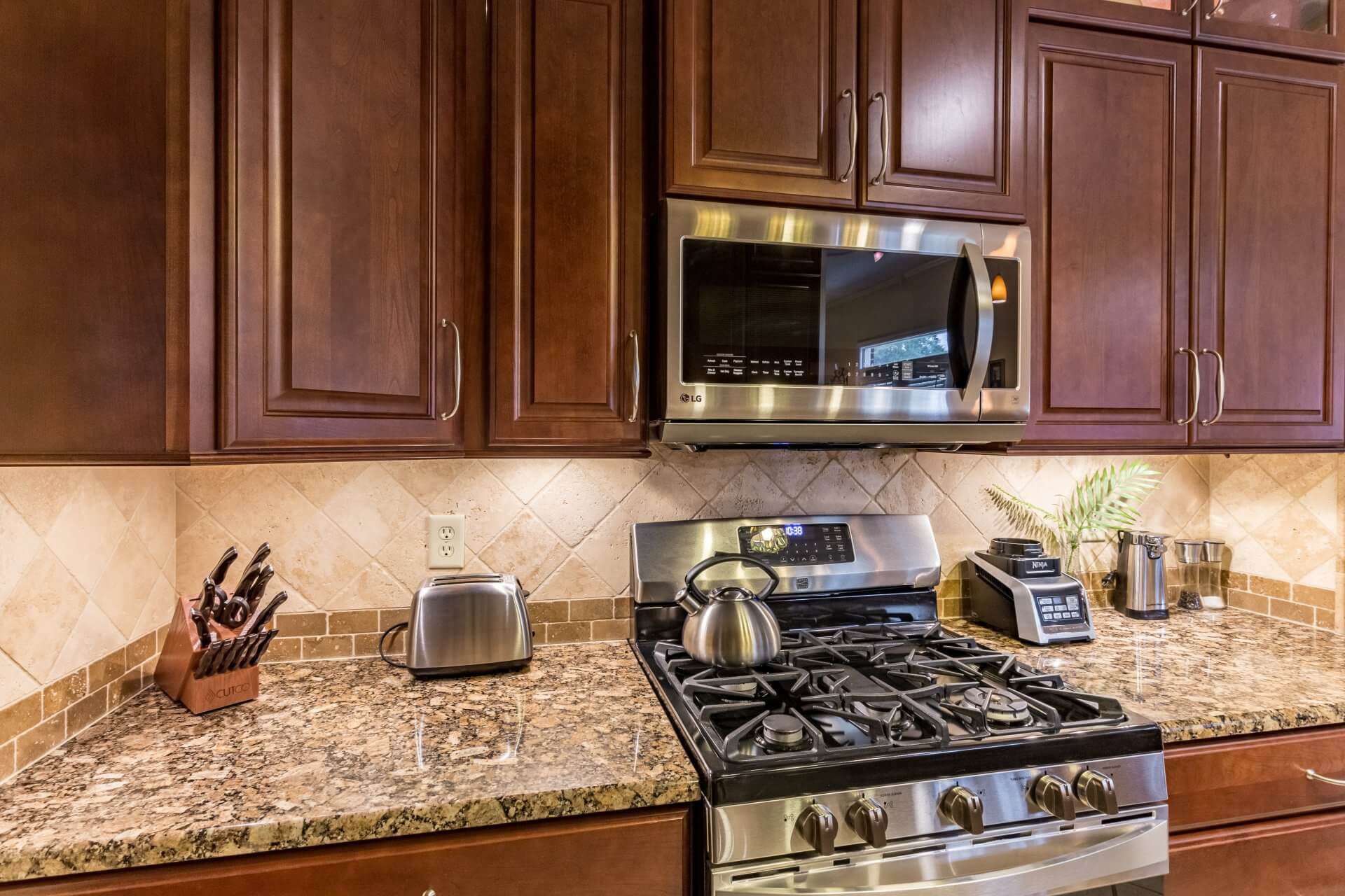
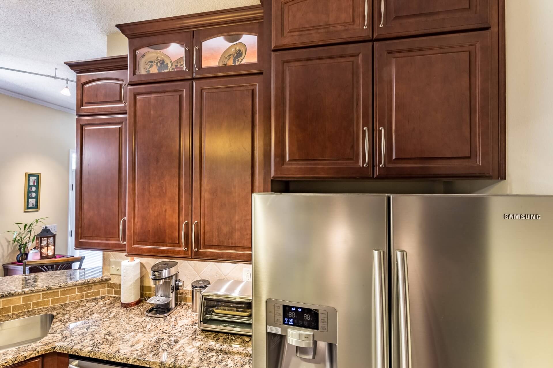
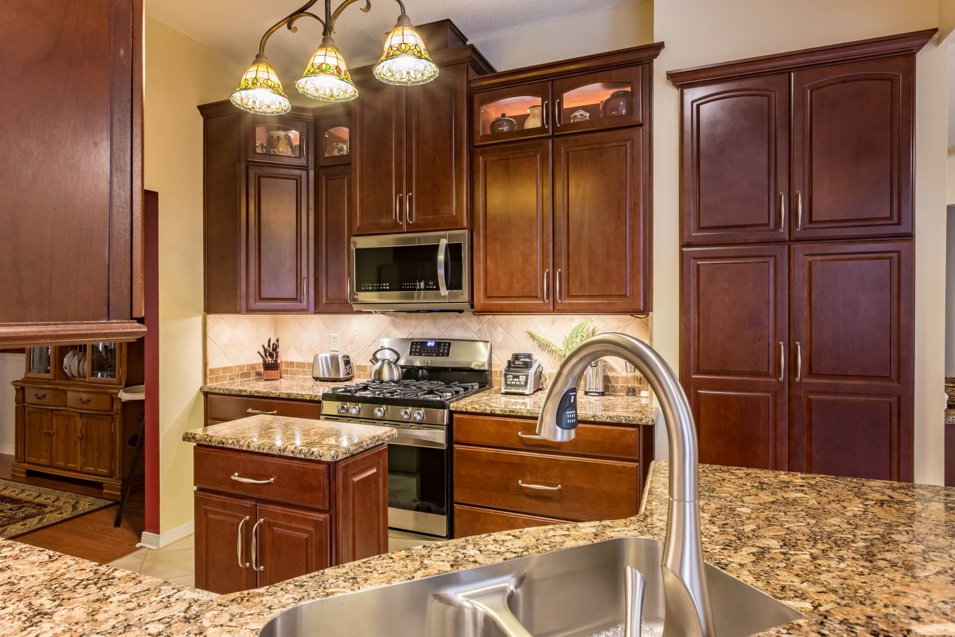
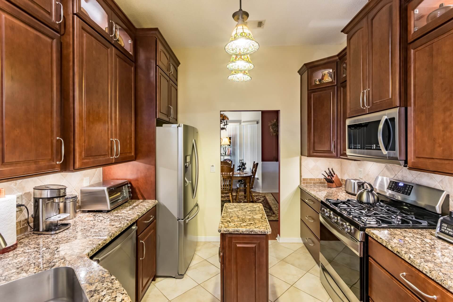
The rich and classic cabinets by Kabinart are from the Cherry Hill collection. Complimentary shiny knobs and pulls from the Top Knobs Shrewsbury collection work beautifully to accentuate the rich wood finish.
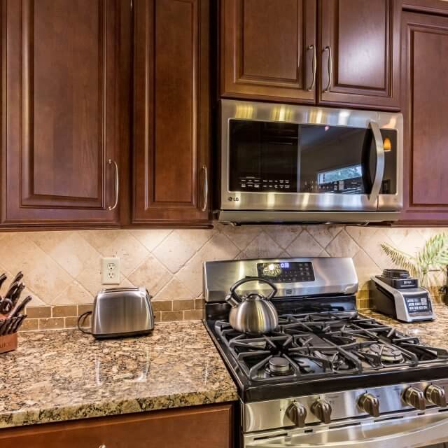
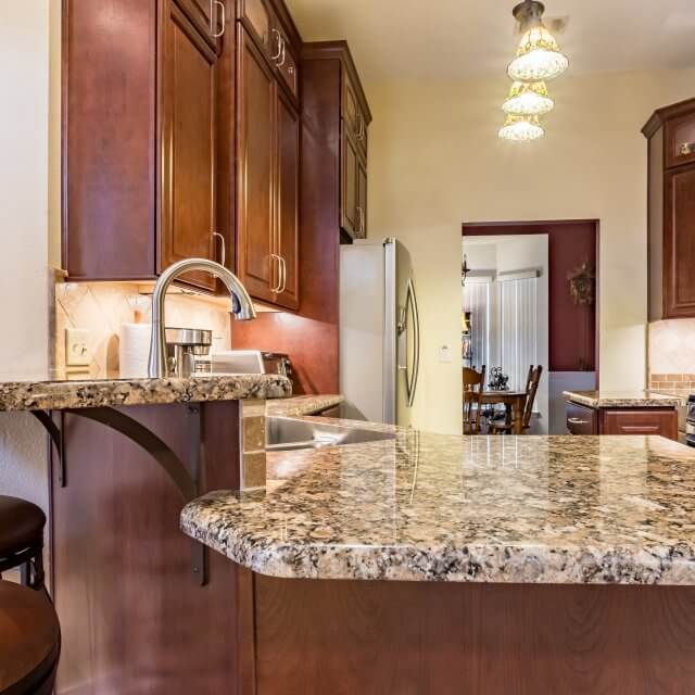
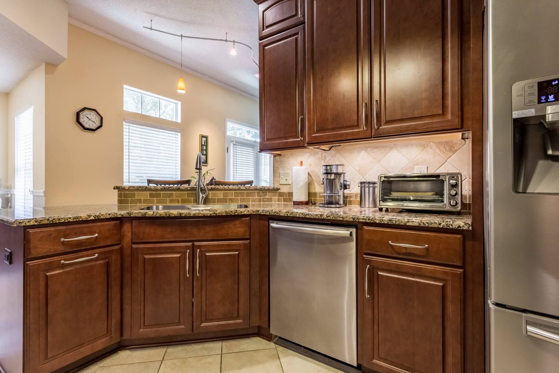
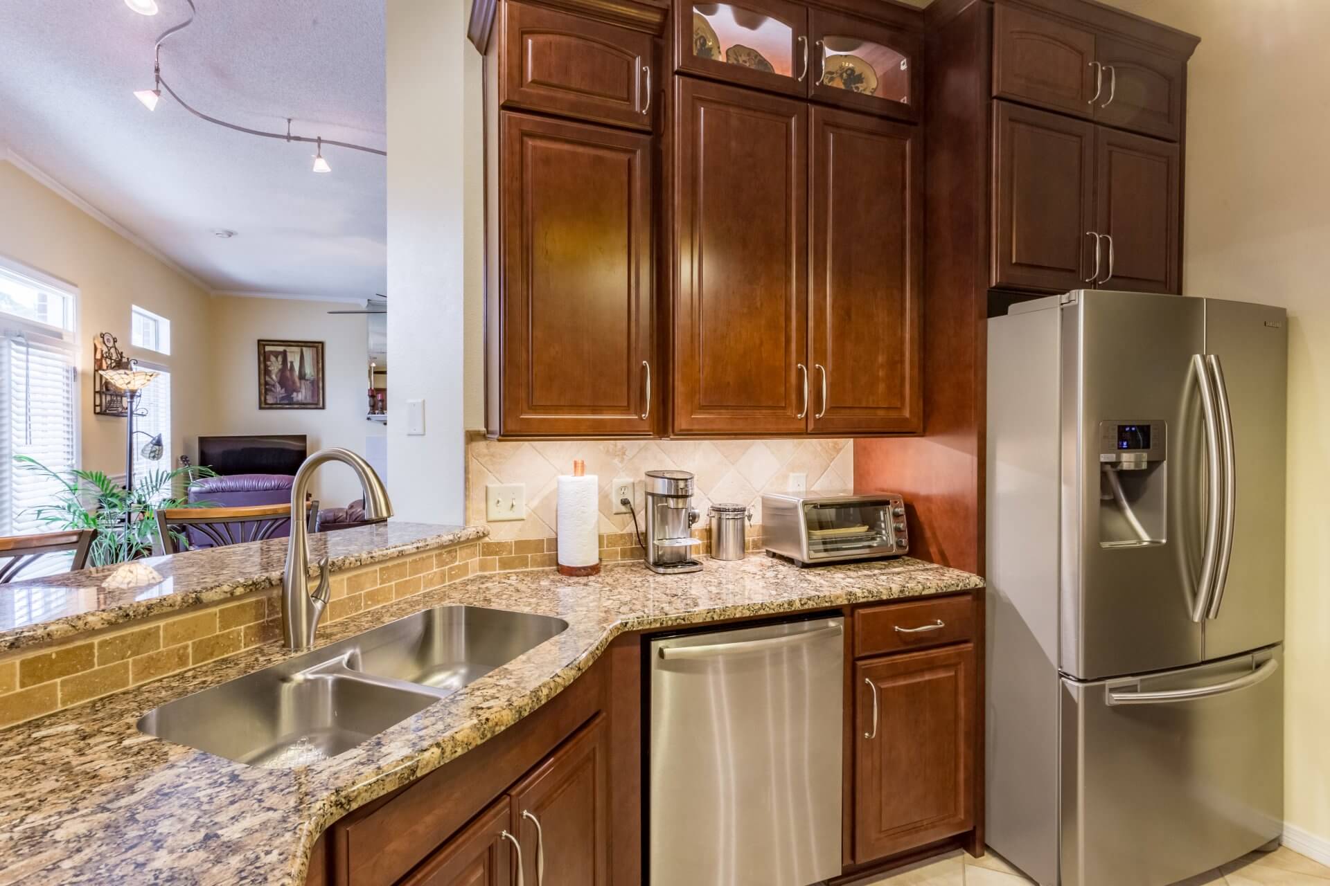
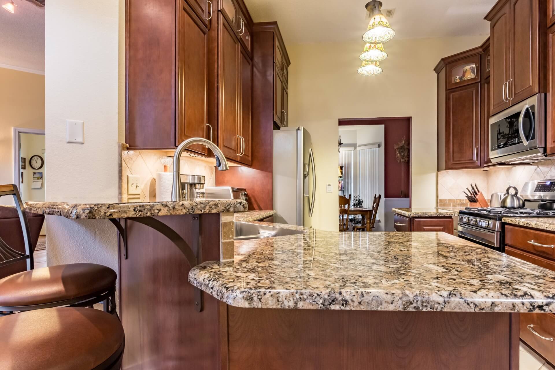
The use of varying heights in the kitchen provides visual interest to the space. For example, the dual-height bar area behind the sink is elevated about six inches where a mocha-colored, brick-patterned backsplash adds contrast. These colors partner wonderfully with the color variation in the granite countertop, mixing earthy tones from light brown to dark black in the speckled pattern.
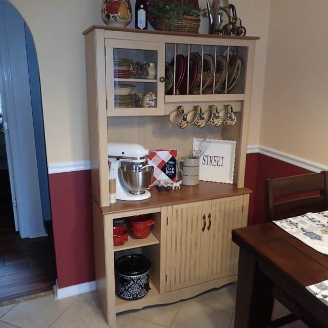
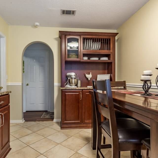
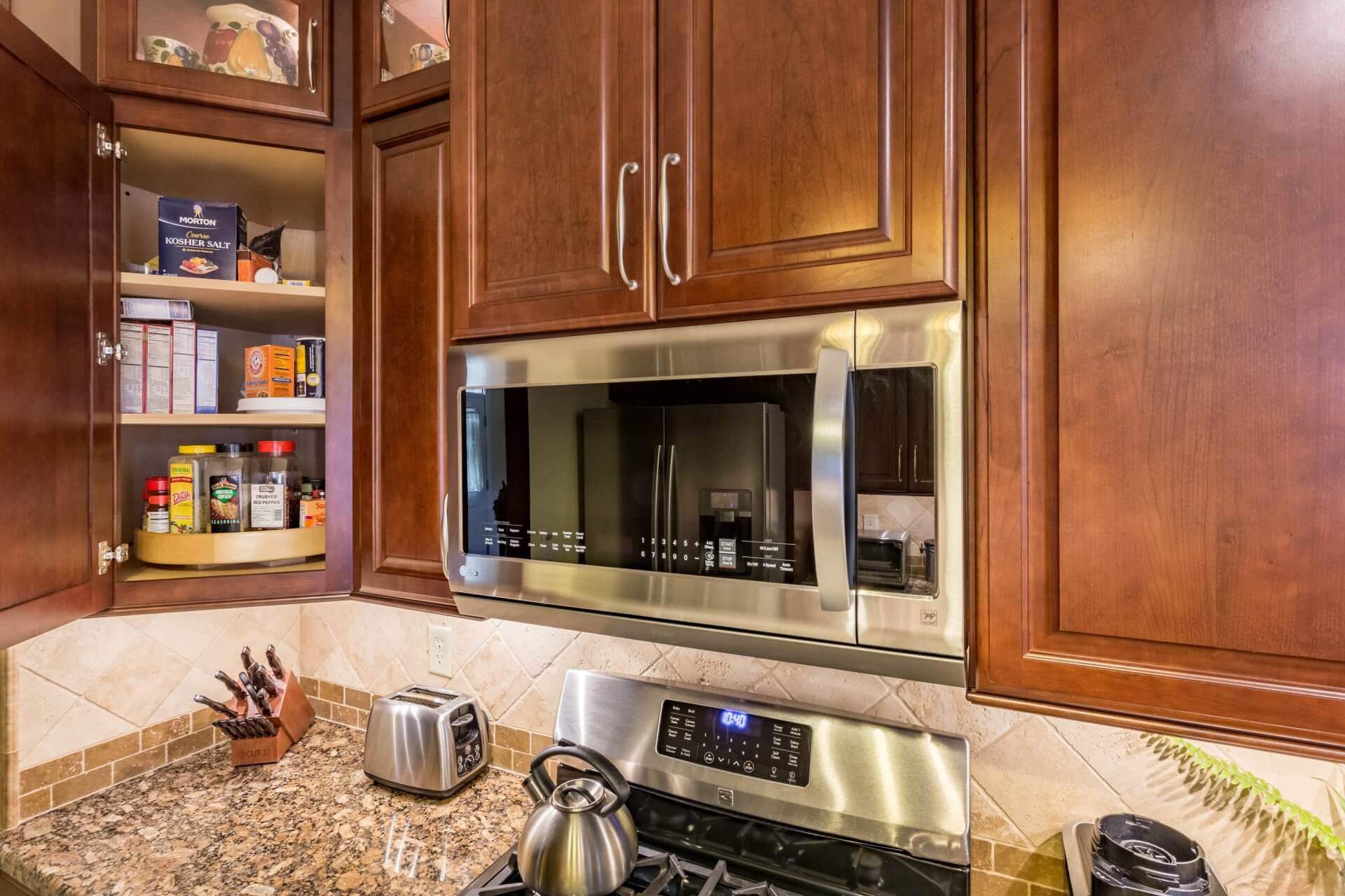
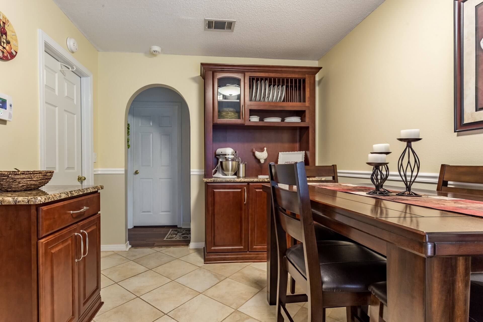
We also built in plenty of everyday cooking convenience to the newly remodeled kitchen. Stainless steel appliances are found throughout the kitchen, and we installed a lazy Susan next to the microwave and stove to provide easy access to herbs and spices. A greatly expanded pantry boasts tons of innovative storage space, including swing out shelves and storage on the doors. The dining room provides additional storage space in a matching custom Kabinart Cherry Hill hutch just off the kitchen.
We also must give credit to Victoria and Audie for having lighting added to the kitchen. It plays a primary role in highlighting the home’s attractive focal points. Soft pink light shines through the upper glass cabinet doors. Plus, under cabinet lighting added to the cherry cabinets, gives the kitchen a warm and inviting feel.
The Cantonment couple completed the kitchen lighting by also having installed a light-hearted, antique-style chandelier, which serves as the main lighting source in the kitchen. This fixture has three long arms lit at each end.
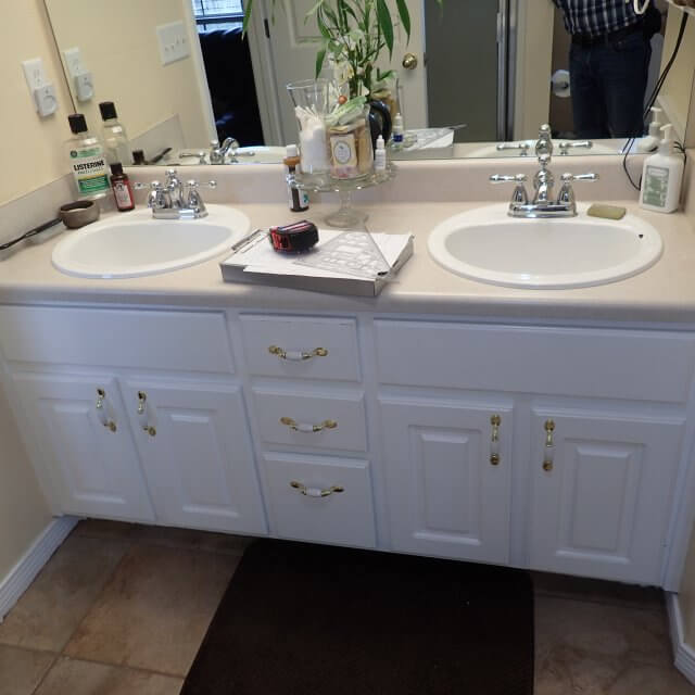
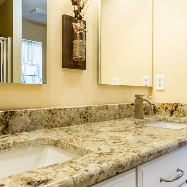
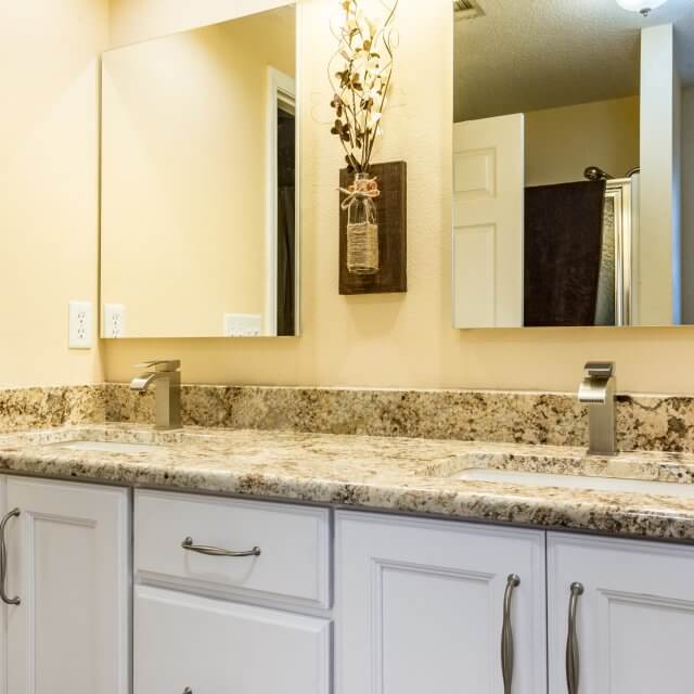
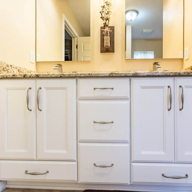
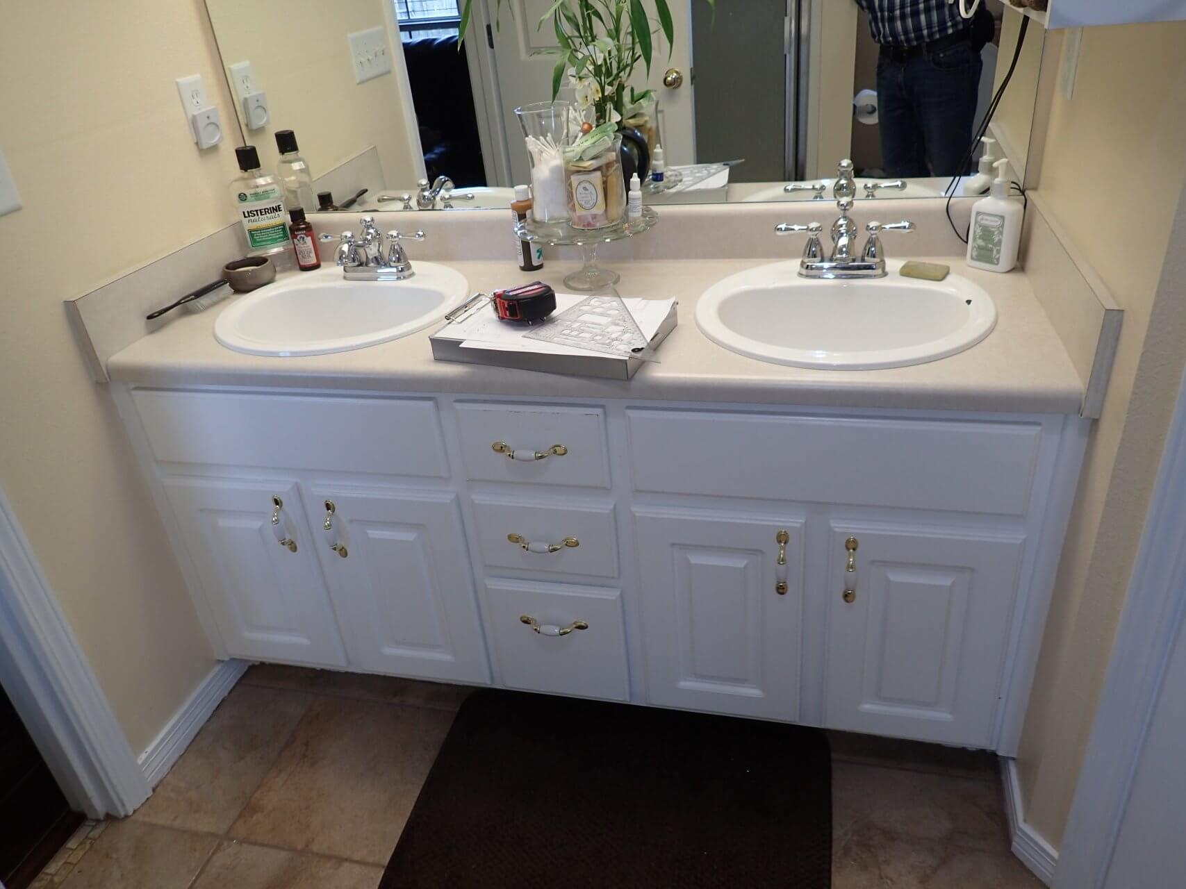
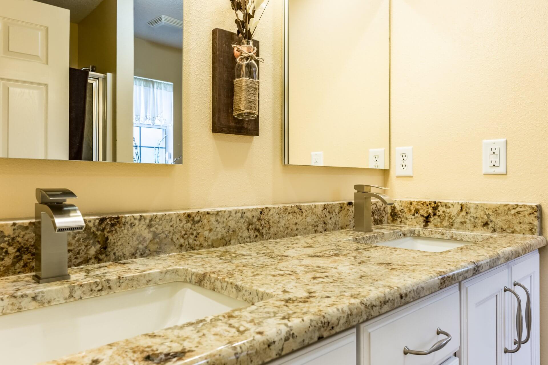
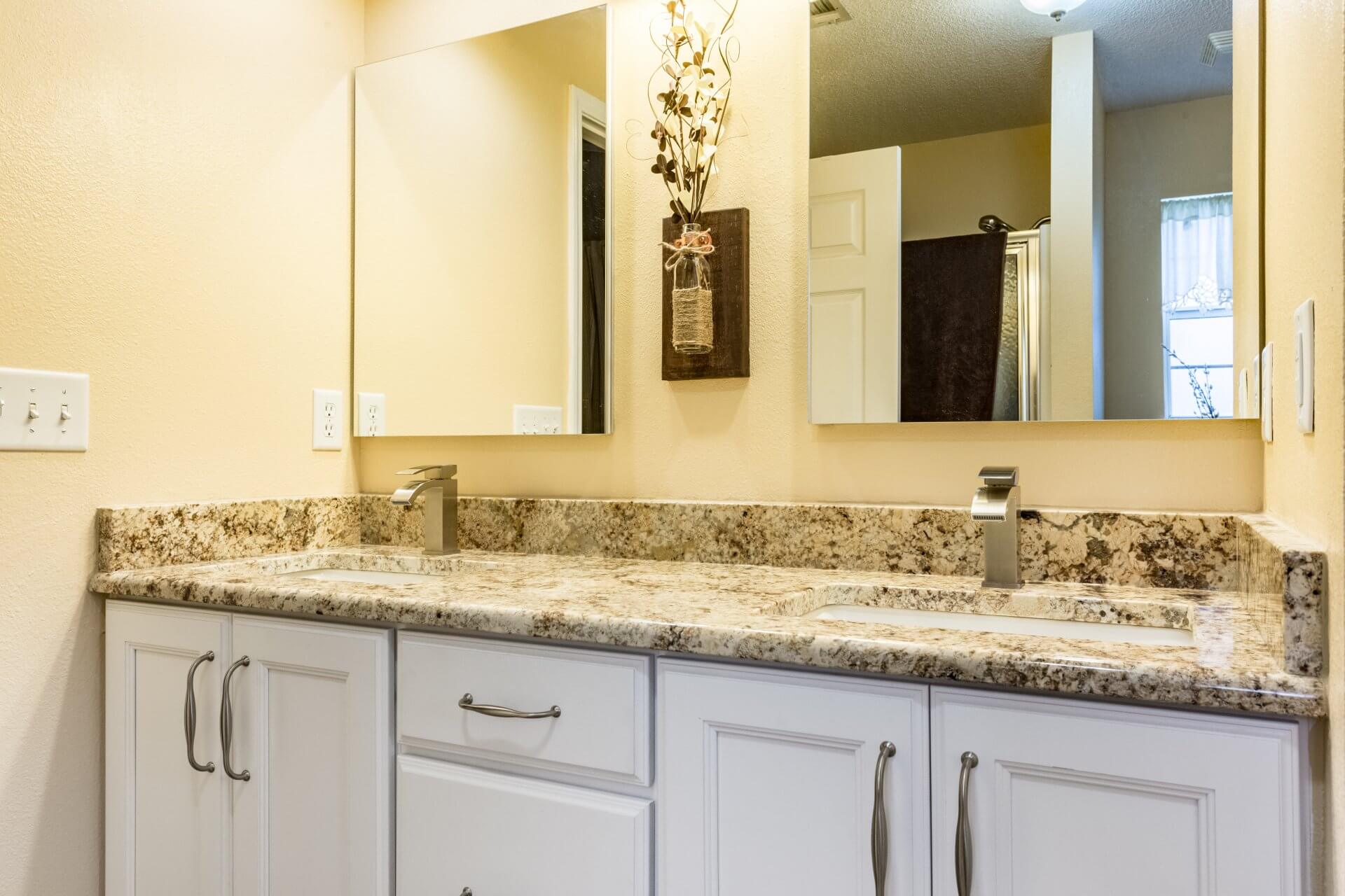
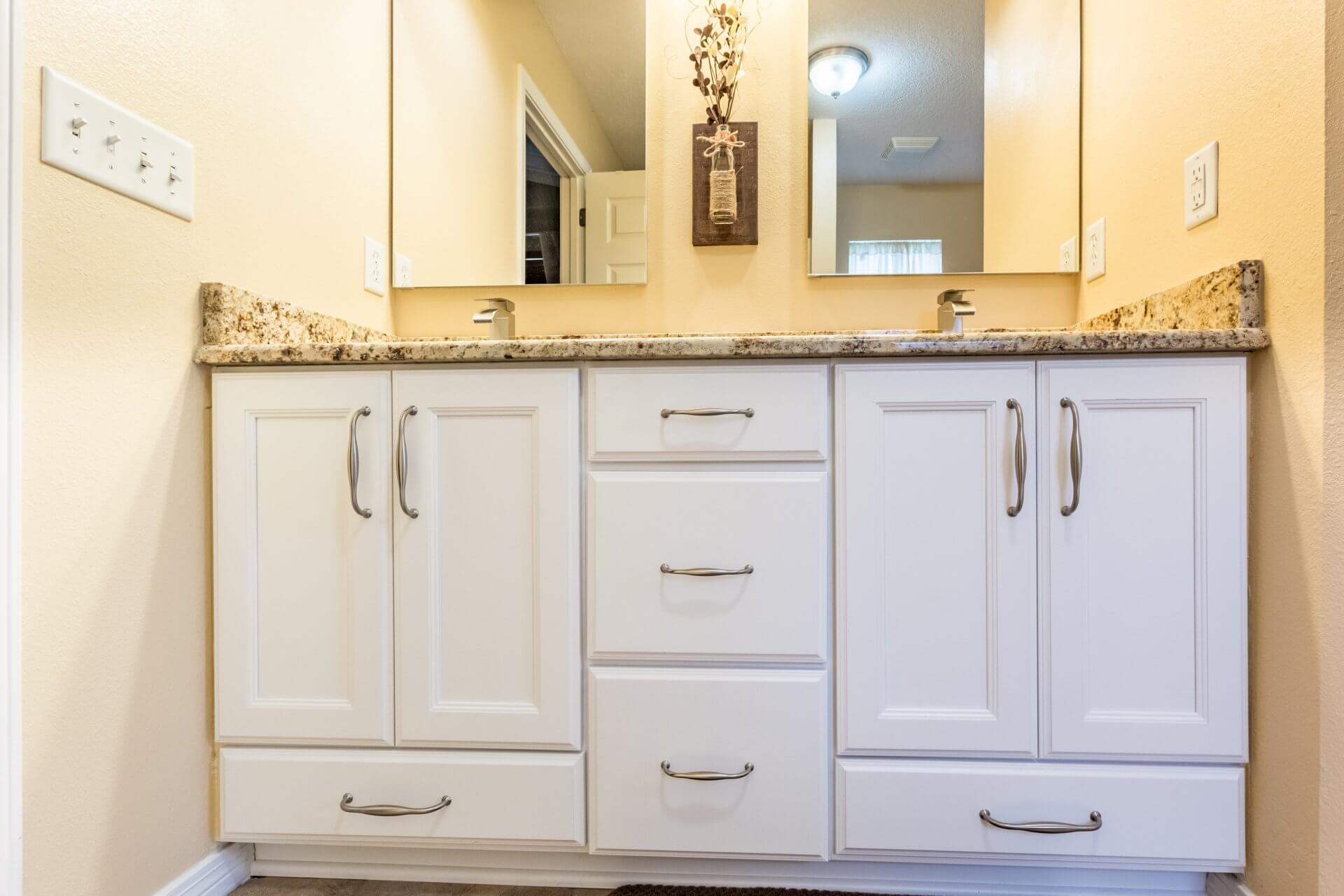
To complete the remodel, we updated Victoria and Audie’s bathroom with new cabinets and fixtures. To make use of every storage opportunity, we included drawers at the bottom of both cabinets near the floor. Again, the homeowners took the initiative and replaced one large mirror with two smaller ones placed over the double sinks, which adds to the bathroom’s attractiveness.

